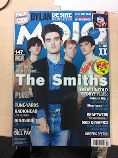
I Mojo magazine is published originally by ‘Emap’ and now since 2008 ‘Bauer’ now publish the magazine. Bauer also publish Q magazine and Kerrang. Mojo is a monthly magazine in the United Kingdom. Bauer also publish women’s magazines such as ‘bella’, ‘take a break’ and many puzzle magazines. The Bauer Publishing Group comprises 282 magazines worldwide in 15 countries, as well as TV and radio stations.
A Mojo magazine target there audience at obsessed music fans. The mean age for readers is 37 year old men. The magazine features genres from modern rock, folk, soul, country and reggae. Mojo delivers a 66% ABCI audience. Readers of Mojo are rather more influences than followers.
I The ideology of the magazine am quite simple. We can see from looking at the front cover what music genre the magazine is and what target audience the magazine might appeal too. I can identify this by what images, text and colours are used on the front of the magazine. Also the front cover is in blue and grey which appeals to men more than women. Also on the front cover they aren’t anything that could appeal to women like images or colours. I also know this magazine is rock, folk magazine by what bands are on the front of the cover.
Front cover-
L The image of ‘the smiths’ on the front cover is a medium shot. The shot is of the full band with the main singer stood at the front (taking up most of the magazine) and the other 3 members stood behind him. The colours of the magazine are all in similar colours blue, white, grey and black. The colours could be like this because of which month the magazine is for (October) because October is seen as a cold month. The main cover line stands out more than the masthead; I think this is because the smiths are such a big band. The cover line is also centered right across the middle of the magazine in bold lettering. The cover lines are located around the sides of the smiths, which makes the band more visible on the page.
R The smiths are represented by the magazine as being a very successful band. We can tell by how much space on the front cover the band take up. Also the singer of the band is stood at the front, I think this is because more people recognize his face than the other members and Mojo want people to see his face first and recognize him straight away.
Contents page-
L The contents page is very minimal with only a small contents box and the image in the background being more dominant. The content box only consists of 5 main stories which would interest the readers more and does not say about any other articles in the magazine. It also gives a brief description of what will be mentioned in these articles giving the reader a brief description of what it’s about.
R The contents page represents the magazine as being a magazine for an older generation (30-40 year olds). This is because of the use of images and text on the contents page. The background image which takes up a lot of the contents page is in black and white and is of 2 people who I do not recognise that look like musicians?
Double Page Spread-
L A lot of the double page spread is taken up by images. The images are of the band members from when they first started out, this links to the front page ‘the birth of a legend the smiths’. The double page spread takes us through the life of the smiths and have used images to show this, they have used images so it’s not all just writing because that would put many people of and they want their readers to be interested. The double page spread is set out in a particular ordered way with the text on the left page and a lot of the images on the left page. They is also a quote in the centre of the page this encourages the reader to read this page.


the people in that picture that you dont recognise are Bob Dylan and Muhammed Ali. How don't you recognise them?! lol
ReplyDeleteMaybe cos I don't listen to this music?! Lol
ReplyDelete